Dashboards Across Space and Time
In Join data across space and time, we learned how to read NYC real estate sales data from several different sources, join them together, and write to GlareDB with a few lines of code. In this blog post, we're going to take that data and use Streamlit to build a dashboard that will help us visualize how the locations and sales change over time.
If you haven't already, we recommend signing up for Cloud and going through the last blog post - this will help ensure that you've readied your data for the dashboard here. If you're already familiar with setting up and using GlareDB, though, feel free to jump right in!
Set-Up
Streamlit is a library that lets you quickly build data apps using
data and Python. If you've worked with Python and Pandas before, the interface will
feel familiar. To get started, make a new directory called glaredb_dashboard/. Then, set
up a Python virtual environment, and install Streamlit:
> python3 -m venv venv
> source ./venv/bin/activate
> pip install streamlit
From there, you can create a new file in glaredb_dashboard/ called
nyc_sales_dashboard.py. In this file, add:
import streamlit as st
st.write("Hello, world!")
st.write() is a quick and general way of writing almost anything
to the screen in your Streamlit app. Then from your terminal, run:
> streamlit run nyc_sales_dashboard.py
When you run this, streamlit will spin up a web server where you can see your app.
If you navigate to the address shown in your terminal, you will see a page that says Hello, world!
Adding Data to Your Dashboard
In the previous blog post, we loaded a bunch of NYC real estate sales data from Parquet files and Google Sheets into our GlareDB table. This data covered all of 2018, and January 2019.
Begin by removing the Hello, world! line, import the GlareDB bindings and set up our connection, as in:
import streamlit as st
import glaredb
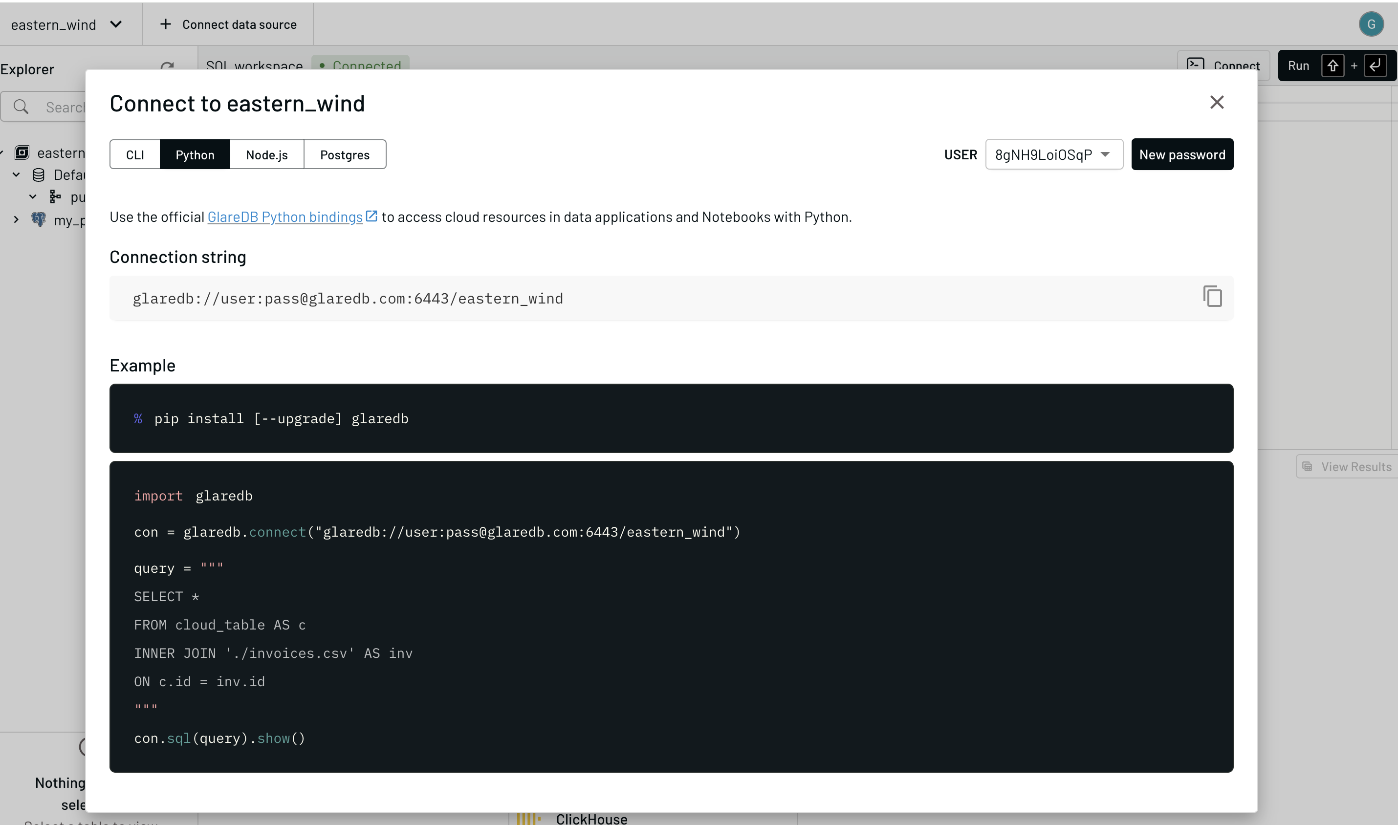
con = glaredb.connect(<YOUR CLOUD CONNECTION STRING>)
You can get your Cloud connection string by going to the Cloud console, clicking "Connect"
in the upper right, selecting Python, and copy the connection string that you see there
(beginning with glaredb://).
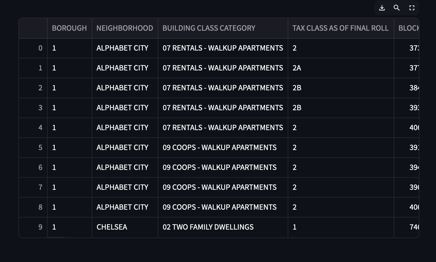
Next, we'll query our table and get a Pandas DataFrame:
df = con.sql(
    """
        SELECT * FROM nyc_sales LIMIT 10;
    """
).to_pandas()

st.write(df)
When you pass in your DataFrame to st.write() and refresh the app, you'll
see the data resulting from the query neatly rendered in an interactive table!
Throughout this tutorial, you can use use st.write() to review your data
and ensure that it looks the way you expect.
Now that you've gotten a glimpse of how readily we can get data from GlareDB and represent it with Streamlit, let's go for something a bit more advanced. It would be cool if to get a visualization to show how the number of sales changes over time.
Sales Over Time
To build a chart to show sales over time, let's start by getting the data we need. We'll use the following query:
sales_over_time_df = con.sql(
    """
        SELECT
        DATE_TRUNC('month', "SALE DATE") as sale_month,
        COUNT(*) as ct
        FROM nyc_sales
        GROUP BY sale_month
        ORDER BY sale_date DESC
    """
)
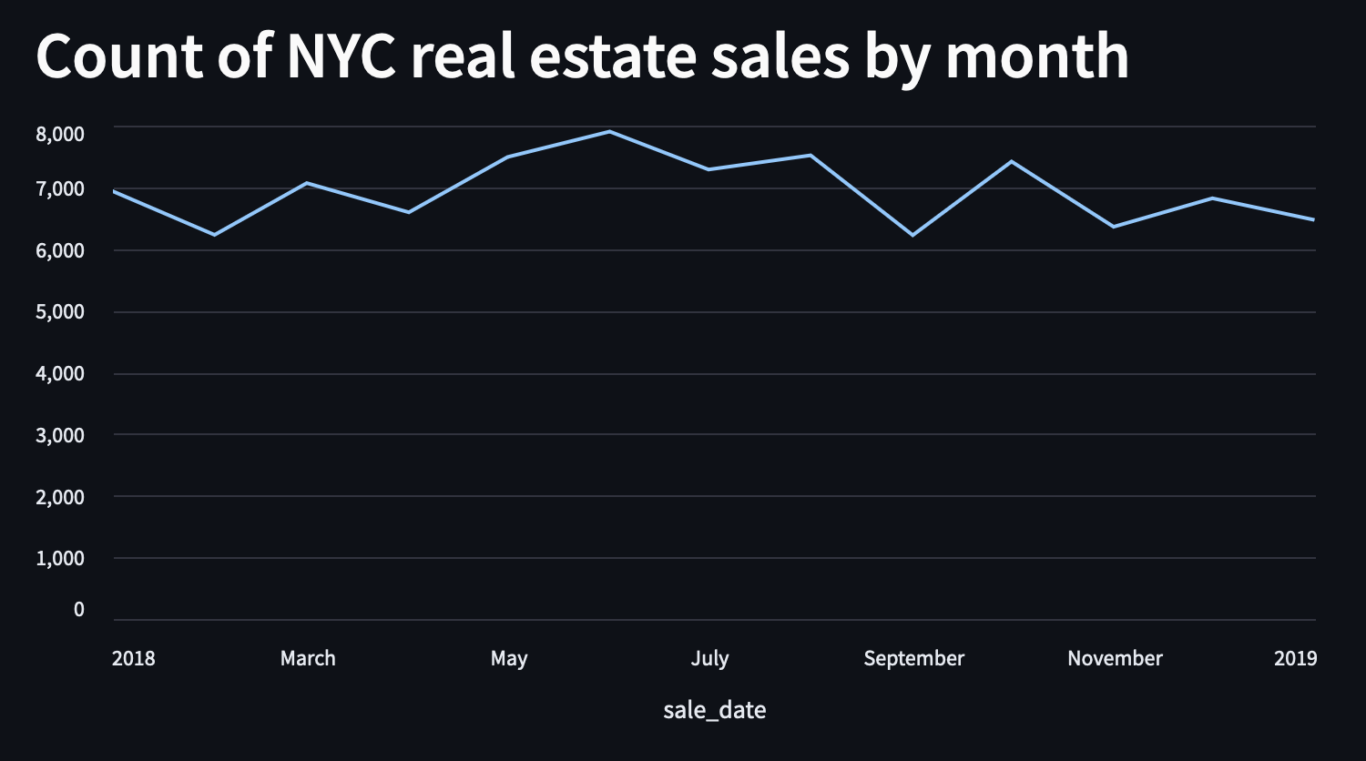
Now we want a line chart, so that we can visualize sales over time. We'll use
st.line_chart() like so:
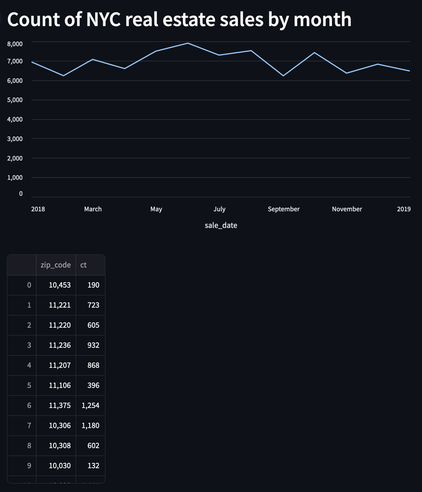
st.line_chart(sales_over_time_df, x="sale_date")
and when we do, we get this nice line chart showing a bit of a peak in the summer months.
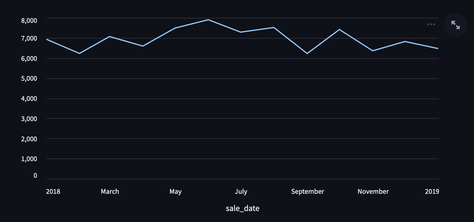
Finally, let's add a header to label our chart by adding this line before the call to
st.line_chart()
st.header("Count of NYC real estate sales by month")
Sales by Zip Code
In addition to having sales over time, I'm interested in visualizing where in NYC
these sales are occurring. To do this, we're going to use a library called
pgeocode to map the zip codes where the sales took place to
lat/long coordinates, which we can then plot on a map. We'll do this in four
parts:
- query our data
- write a function to take zip codes and turn them into lat/long coordinates
- add the lat/long information to our data
- plot the data on a map
Query the Data
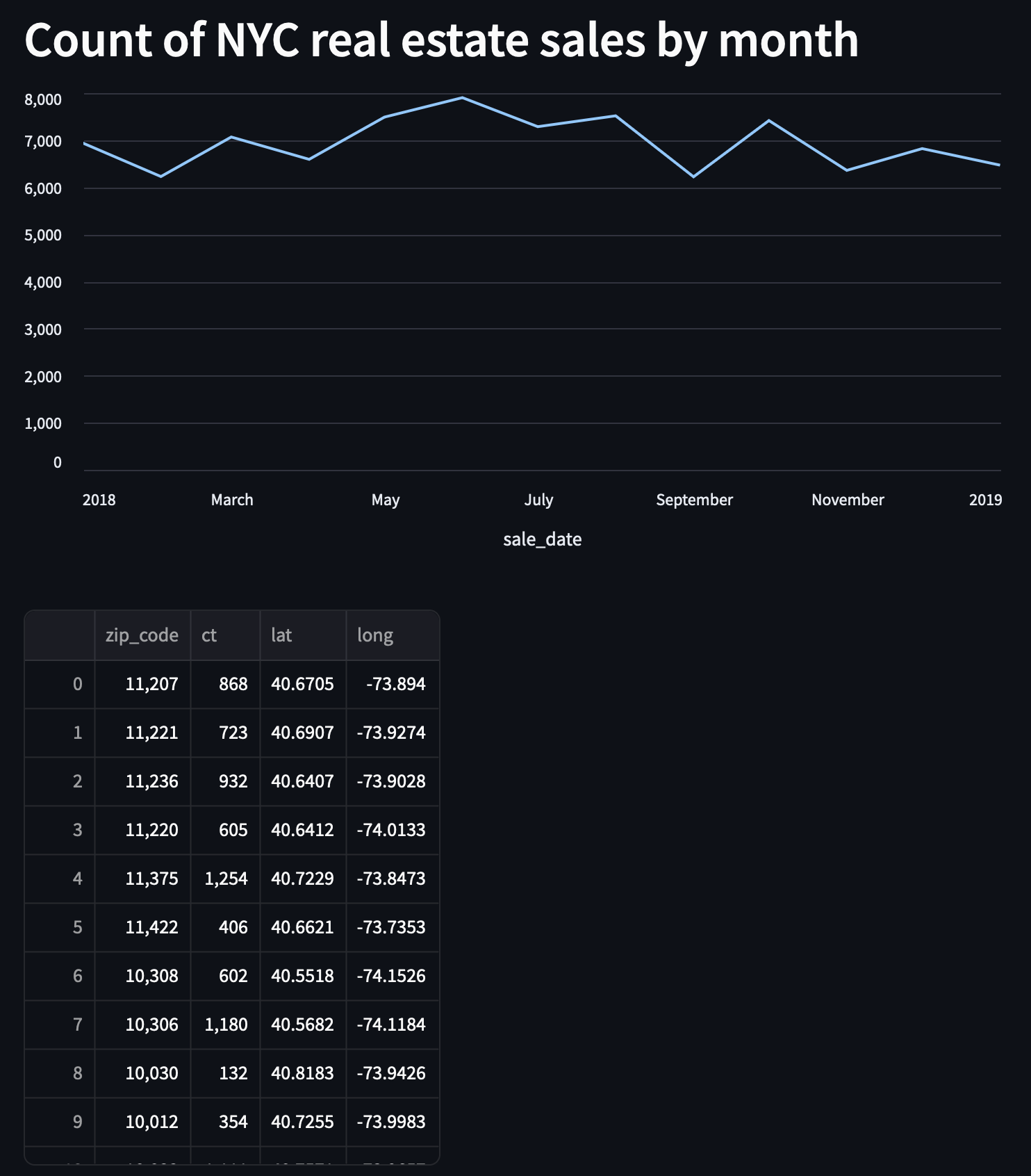
Just like we got the date-specific data above, we'll get some location-specific data here. The query to use for this is below. We will also filter out NULL and 0 values to prevent errors with the rendering below.
zip_code_df = con.sql(
    """
        select "ZIP CODE" as zip_code, COUNT(*) as ct from nyc_sales
        WHERE ("ZIP CODE" IS NOT NULL)
        AND ("ZIP CODE" <> 0)
        GROUP BY "ZIP CODE"
    """
).to_pandas()

st.write(zip_code_df)
Write a Function to Transform the Data
Now that we've gotten our data, let's create the function that will transform it.
import pgeocode
nomi = pgeocode.Nominatim('us')
def get_lat_long(nomi: pgeocode.Nominatim, zip_code: int):
    qpc = nomi.query_postal_code(zip_code)
    return {
        "lat": qpc.latitude,
        "long": qpc.longitude
    }
Let's break down the steps above. First, we import pgeocode. Then we
instantiate an object called a Nominatim from pgeocode for the US -
this will let us query postal codes in the US. Finally, we write a
function that takes this Nominatim and takes a zip code and returns a
dictionary with the latitude and longitude. In the next step, we will
use this function to add the lat/long coordinates to our data.
Add the Lat/Long Coordinates
Using Pandas and the function we just wrote, we can take our zip codes from the DataFrame, and append two columns, one with latitude and one with longitude.
zip_code_df[["lat", "long"]] = zip_code_df.apply(
    lambda row: get_lat_long(nomi, int(row['zip_code'])), axis=1, result_type="expand"
)
st.write(zip_code_df)
In the line above, we are using Pandas .apply() to take values from each row
and use those to add values to two new columns for latitude and longitude. We
take the zip code in every row and feed it to the get_lat_long function.
axis=1 tells Pandas that we want the operation to be row-wise instead of
column-wise. Then, we take the resulting dictionary, and expand it to fill
both of our columns.
Map the Data
Now that we have our shaped DataFrame, we can map it. You may notice that due
to an oddity with NYC zip codes, one our rows is missing lat/long coordinates.
Streamlit can't render NA values, so we'll drop the NAs in the DataFrame that
we pass to our st.map() call. We'll also add a heading for this map.
st.header("NYC real estate sales by zip code")
st.map(data=zip_code_df.dropna(), latitude="lat", longitude="long", size="ct")
You'll see that we pass our DataFrame (sans NAs) to st.map(), tell it which
columns to use for latitude and longitude, and we also specify to use the
counts from our ct column to determine the size of the bubbles. And when we
get a pretty nice visualization!
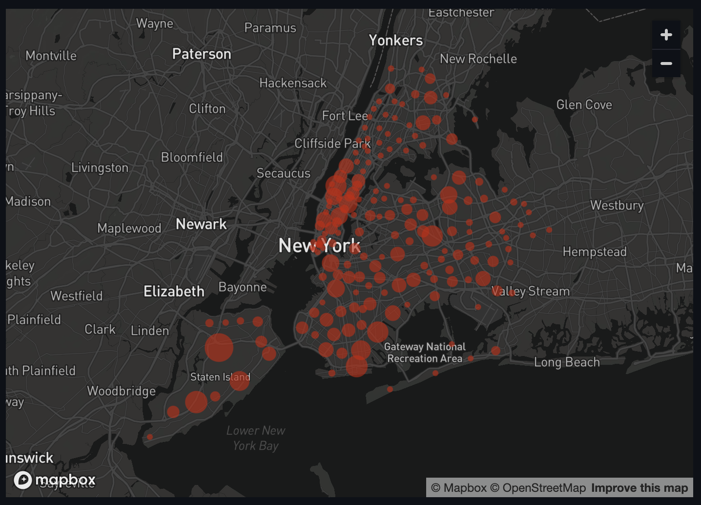
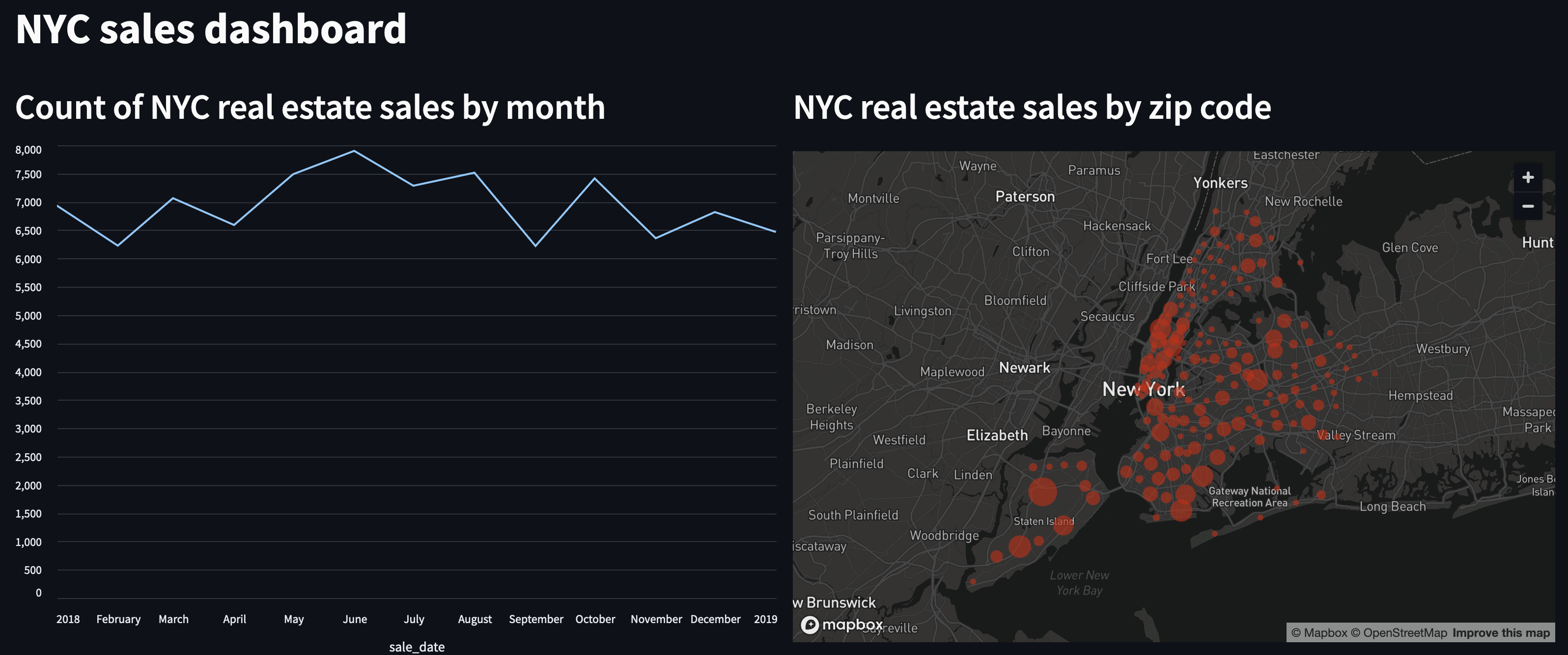
Overall it looks like there have been the most sales closer to Manhattan, and the fewest in the Bronx and eastern Queens and Brooklyn.
Cleaning Up
To make things a bit neater, Streamlit lets us use columns and other containers
to put our plots side-by-side. To do this, we'll first instantiate Streamlit
columns and assign them to a variable. Then we'll take our calls to
st.line_chart() and st.map() (and the matching headers) and using with
blocks, we'll add them to each of our new columns.
col1, col2 = st.columns(2)

with col1:
    st.header("Count of NYC real estate sales by month")
    st.line_chart(sales_over_time_df, x="sale_date")

with col2:
    st.header("NYC real estate sales by zip code")
    st.map(data=zip_code_df.dropna(), latitude="lat", longitude="long", size="ct")
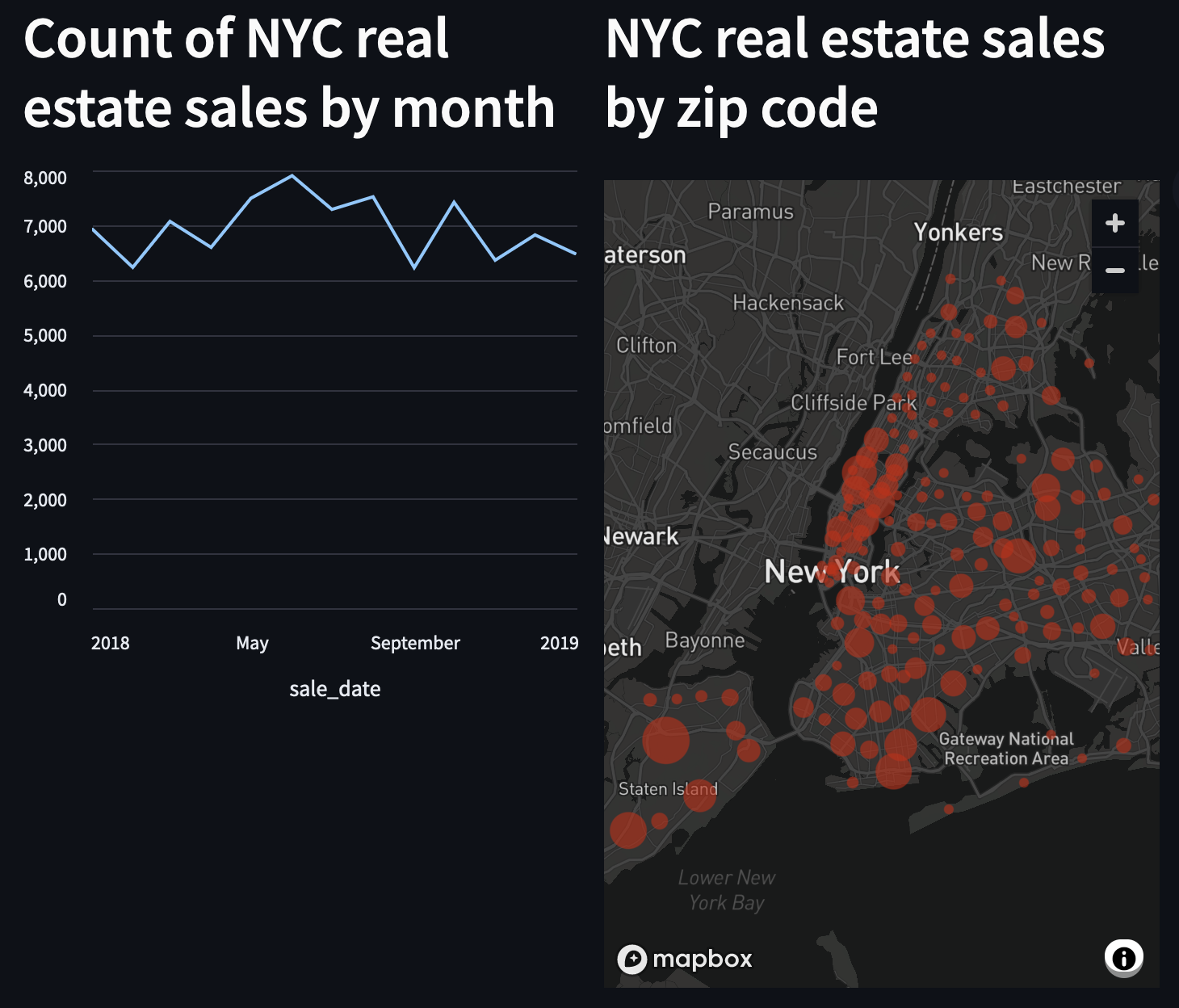 There are a few more things to do to add some polish:
- widen the plots to better use the space
- add a title to the dashboard
- make the line chart the same size as the map.
First, let's set the width of our page and add the title. Above our instantiation of the display columns, we can add a call to set our page config, and add the title:
st.set_page_config(layout="wide")
st.title('NYC sales dashboard')
Then, we'll add a height argument in our call to st.line_chart():
st.line_chart(sales_over_time_df, x="sale_date", height=540)
Here's the full code snippet!
import streamlit as st
import glaredb
import pgeocode


con = glaredb.connect(
    "glaredb://6AhiEN7GQDmo:<PASSWORD>@o_PRocU0j.remote.glaredb.com:6443/rough_glitter"
)

sales_over_time_df = con.sql(
    """
        select DATE_TRUNC('month', "SALE DATE") as sale_date, COUNT(*) as ct from nyc_sales GROUP BY sale_date
        ORDER BY sale_date DESC
    """
).to_pandas()

zip_code_df = con.sql(
    """
        select "ZIP CODE" as zip_code, COUNT(*) as ct from nyc_sales
        WHERE ("ZIP CODE" IS NOT NULL)
        AND ("ZIP CODE" <> 0)
        GROUP BY "ZIP CODE"
    """
).to_pandas()

nomi = pgeocode.Nominatim('us')
def get_lat_long(nomi: pgeocode.Nominatim, zip_code: int):
    qpc = nomi.query_postal_code(zip_code)
    return {
        "lat": qpc.latitude,
        "long": qpc.longitude
    }

zip_code_df[["lat", "long"]] = zip_code_df.apply(
    lambda row: get_lat_long(nomi, int(row['zip_code'])), axis=1, result_type="expand"
)


st.set_page_config(layout="wide")

st.title('NYC sales dashboard')

col1, col2 = st.columns(2)

with col1:
    st.header("Count of NYC real estate sales by month")
    st.line_chart(sales_over_time_df, x="sale_date", height=540)

with col2:
    st.header("NYC real estate sales by zip code")
    st.map(data=zip_code_df.dropna(), latitude="lat", longitude="long", size="ct")
Conclusion
And there you have it!
With fewer than 50 lines of code, we've queried our data twice, created two illustrative charts, and set up a dashboard. With a bit more work, you can do things like hosting the dashboard using Streamlit Community Cloud, and even add buttons and sliders to make the dashboard even more interactive (sales by zip code by date, maybe?).
You may have noticed some of the filtering we had to do. In the coming weeks, we'll show how to add more data quality checks to your GlareDB data, and do some more data exploration and visualization!